
As your hosting partner, we’ve put together a fresh look at what your website could do next. Explore the Website, SEO, and AI Search review, then take a look at two possibilities for a clearer, more welcoming online experience.
www.anesthesiamobile.net
A review of your website, search visibility, and AI-search presence. Explore each area, then compare the two design directions below.
Scored review · September 29, 2026. Six equally weighted editorial dimensions per pillar. AI findings reflect a small, one-day Google/ChatGPT sample, not market share or a recurring visibility benchmark.
Useful care resources are in place. Clearer contact actions, a better mobile introduction, and consistent billing information are the priorities.
Explore the findingsBuild on existing organic discovery with stronger page metadata, cleaner sitemap coverage, and a confirmed service-area explanation.
Explore the findingsAlready mentioned and sourced in local and pediatric answers, but coverage is uneven. Clearer practice facts and reviewed answers would strengthen the foundation.
Explore the findings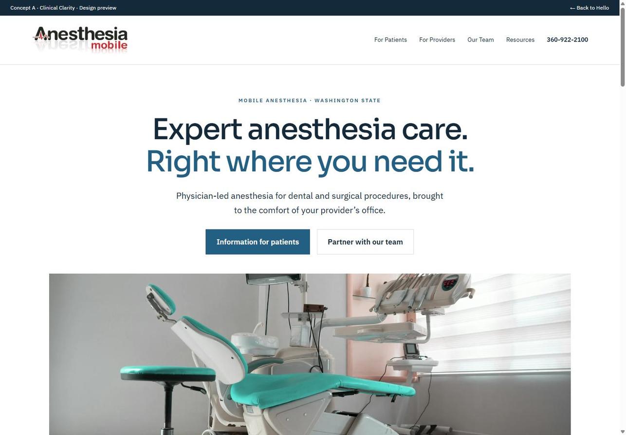
Confident typography, generous white space, and a crisp blue palette put the care model front and center. Clear patient and provider paths make the next step easy to find.
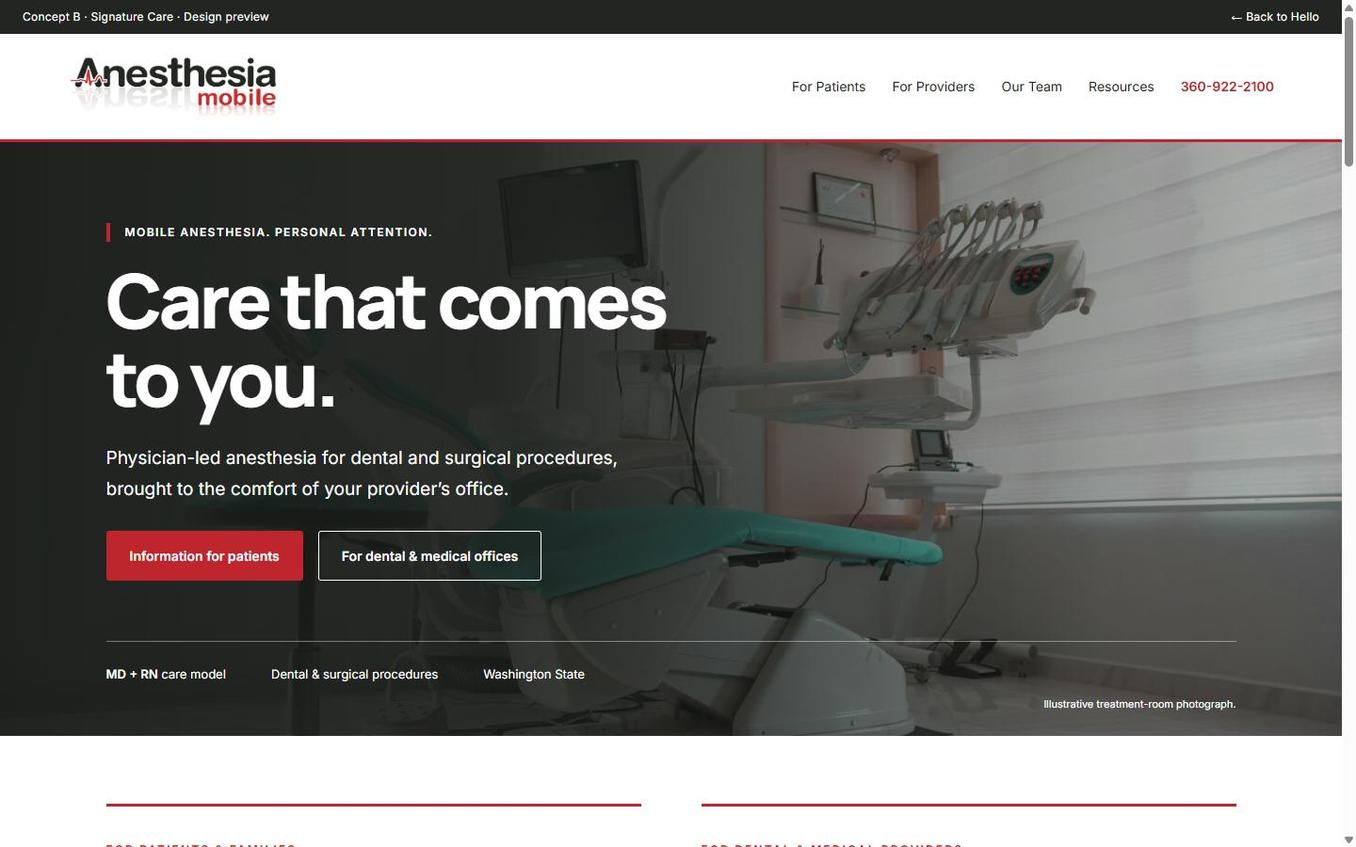
Charcoal, clean white, and a restrained logo-red accent create a more brand-connected direction. A full-width photographic hero puts the mobile care service first, with confident type and clear patient and provider paths.
Take a look through the concepts to see a few possibilities for your website. Explore them on desktop or mobile to get a feel for each direction.
You’re not limited to the styles shown here. We’re happy to explore other directions and tailor the design around your business, audience, and goals.
Have a question or an idea you’d like to discuss? Reply to the person who shared this page. No need to choose a design; we’d simply like to hear what you have in mind.
Your website should do more than look good. It should help the right people find you, understand what you offer, and take the next step. With 20 years of web design and digital marketing experience, ClickMonster brings design, search visibility, and ongoing support together to help your business move forward.